Skip to product information

Struggling with low sales or user drop-offs on your online store? Our Professional Webshop Usability & Conversion Analysis will pinpoint exactly what’s holding your site back and how to fix it. We dive deep into your website’s user experience and sales funnel to find what’s working, what isn’t, and where you can boost conversions. The result is a comprehensive, plain-English PDF report full of actionable recommendations to improve your site’s usability, build customer trust, and increase sales.
-
Expert Evaluation: Get an analysis by an experienced e-commerce UX specialist – no generic automated audit, but a tailored review specific to your site.
-
Visual Proof: Every finding is backed by screenshots and annotations, so you won’t just hear about issues – you’ll see exactly what a user sees.
-
Actionable Insights: We provide concrete advice and best practices (backed by UX research) that you can directly apply to make improvements.
-
Fast & Friendly: Choose Standard (ready in 3 business days) or Premium (ready in 5 business days) delivery. Either way, you get a jargon-free, conversational report that’s easy to understand and implement.
What’s Included in the Analysis?
We split this service into two parts – a Usability Audit and a Conversion & Barriers Analysis – to cover all angles of your webshop’s performance:
Part 1: Usability Audit (UX Review)
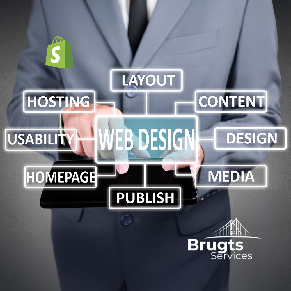
In the usability audit, we evaluate your site against 8 key usability guidelines, focusing on real user behavior and concrete examples (no vague “nice design” comments!). We check:
-
Top Tasks: Can customers easily complete the main goals on your site (e.g. finding a product, adding to cart, checking out)? We simulate these critical tasks to identify any pain points or confusion.
-
Navigation: Is your menu and page structure intuitive? We assess if users can find what they need without getting lost. Clear, consistent navigation is crucial – if shoppers can’t navigate confidently, they’ll likely leave.
-
Layout: We examine your page layouts for clarity and coherence. Is information presented in a clear hierarchy, or is it visual chaos? A clean layout guides the eye; a cluttered one overwhelms it.
-
Speed & Performance: We test your site’s load times because speed matters – online shoppers are impatient. We’ll identify if slow performance could be driving users away and suggest how to improve it.
-
Text Content: We review the wording on your site – product descriptions, headlines, help text, etc. Is it relevant, clear, and well-written for your audience? Good content should speak the users’ language and compel them to take action.
-
Calls-to-Action (CTAs): Are your buttons and prompts obvious and enticing? We ensure it’s always clear what action you want the user to take next. (For example, “Add to Cart” buttons should stand out and use action-oriented text.) If CTAs are hidden or confusing, conversions suffer.
-
Forms & Checkout: We go through any forms (newsletter sign-ups, account creation, checkout process) to see if they are smooth or causing friction. We’ll point out any form fields or steps that might be streamlined.
-
Conventions (Jakob’s Law): Does your site follow common web design conventions? Users spend most of their time on other websites, so they expect yours to work in a familiar way. We check for alignment with standard e-commerce practices (layout of the cart, placement of login, search bar, etc.) to ensure nothing quirky is unintentionally confusing your visitors.
Throughout Part 1, every issue we find is explained with a concrete example. If we say a form is hard to use, we’ll show a screenshot of the form with notes pointing out the problem. This way, you get a crystal-clear view of what shoppers are experiencing on your site.
Part 2: Conversion, Barriers & Improvement Tips
In Part 2, we analyze how well your site converts visitors into buyers and where potential customers might be dropping off. We’ll follow the marketing funnel from the first impression down to checkout, using an “obstacle pyramid” approach to identify any blockers at each step. Our conversion analysis covers:
-
Value Proposition: We assess whether it’s immediately clear why someone should buy from your site. What’s your unique value or offering? If new visitors can’t tell within seconds why your webshop is special or trustworthy, they may leave. We’ll see if your homepage and product pages convey a compelling reason to stay and shop.
-
Technology & Performance: Any technical flaws or limitations that could hurt conversions will be noted here. This includes broken links, error messages, or site downtime. We’ll also tie in the performance findings from Part 1 – for instance, if slow load times or bugs might be causing users to give up. (No one will buy if the site crashes or feels too slow.)
-
Functionality: We test key site features to make sure everything works as it should. Can users filter products, search the site, zoom in on images, etc.? Are there features missing that users might expect (for example, a shop selling pianos might benefit from a comparison tool or sound demos)? We identify what’s working well and what functionality gaps exist.
-
Usability Barriers: Here we consider the cumulative effect of the usability issues found in Part 1 on your conversion funnel. Maybe your navigation (from Part 1) is confusing – we’ll discuss how that might be causing drop-offs before users even reach checkout. Perhaps a form error is scaring people away – we connect those dots so you know which UX issues are truly hurting sales.
-
Emotional Triggers & Trust: We examine elements that build trust or skepticism. This includes looking for trust badges, reviews or testimonials, return policy clarity, site security indicators, and overall branding consistency. We ask: What on your site gives a first-time visitor confidence to make a purchase, and what might give them second thoughts? For example, lack of contact info or an outdated design can create doubt. We’ll highlight these emotional conversion factors.
-
Conversion Techniques: We identify which persuasive techniques are being used and which are missing. Is there a clear call-to-action on each page? Are you using urgency or scarcity (like “Only 2 left in stock!” notifications) appropriately? Are there reminders for free shipping thresholds, or email capture offers for first-time buyers? We’ll point out opportunities where adding a conversion booster (like a limited-time discount banner or a more prominent CTA) could increase sales.
-
Mobile Experience: A huge portion of online shopping happens on mobile devices, so we won’t ignore it. We’ll review your webshop on a smartphone to check if it’s mobile-friendly or frustrating on a small screen. If buttons are too small or the layout breaks on mobile, we’ll catch it. Mobile users have even less patience, so a poor mobile UX can seriously hurt conversions. We’ll give you specific mobile optimization tips if needed.
-
General Suggestions: Finally, we compile any other improvement ideas that don’t fit neatly in the above categories. Sometimes we notice a small design tweak, content change, or marketing idea that can help — and we include those too. Think of it as a grab-bag of additional tips (maybe around SEO, accessibility, or content tone) to further enhance your site’s performance.
As part of this conversion analysis, we also provide a brief competitor check. We’ll identify two direct competitors in your niche and give you a short observation on each (just a few sentences). For example, we might note “Competitor A’s site loads very fast and has a simpler checkout than yours” or “Competitor B heavily emphasizes their free shipping, which is something you could consider highlighting.” This way, you get context on how your site stacks up and inspiration for improvements.
We wrap up Part 2 with a short reflection: would we personally buy something from your site? We answer honestly and explain why or why not. This candid reflection sums up the overall user experience and trust level your site conveys. It’s like getting the perspective of a friend or typical customer – invaluable feedback that can often highlight the big-picture impression of your webshop.
Deliverables & Packages
You will receive a well-structured business report (PDF) with all our findings and recommendations. The report is written in a confident, conversational tone – easy to read and understand for any member of your team. Expect a length of about 5–10 pages full of insights, illustrations, and helpful advice. Every section of the report includes annotated screenshots or visuals where relevant, so you can literally see what we’re talking about. We don’t just tell you the problems; we show you. And for every issue identified, we suggest practical next steps to fix or improve it.
We offer two package options for this service:
-
Standard (€180) – Comprehensive analysis covering all the points above, delivered within 3 business days. This option gives you a concise (~5 page) report focusing on the most critical findings and recommendations. It’s perfect if you need quick insights or are on a tighter budget, without compromising on quality.
-
Premium (€300) – Deluxe in-depth analysis, delivered within 5 business days. You get everything in Standard plus extra depth: a more extensive report (closer to 10 pages) that delves further into details, additional examples, and extended competitor research. Choose Premium if you want the fullest possible insight into your webshop, and don’t mind a slightly longer turnaround for a richer report.
Ordering is simple: instead of an instant “add to cart,” we use a short request form so you can tell us about your website (and any specific concerns or goals you have). Once you submit the form, our team will follow up with you personally – we’ll confirm the details, answer any questions, and provide instructions for payment. This one-on-one approach ensures we fully understand your needs before we begin. After that, we’ll get to work on your audit. Delivery of your PDF report will be via email by the promised date (3 or 5 business days from the start, depending on the package). We’ll also be available for any brief follow-up questions you might have after reading the report – we want to make sure you get the most value from our analysis.
Note: This service is an analysis and recommendation report; it does not include implementing the changes we suggest (we don’t alter your website’s code or design as part of this product). However, if you need help acting on our recommendations, we can certainly assist with that as a separate service. Our goal is to equip you with a clear game plan – and we’re here to help you execute it if needed.
Ready to Boost Your Webshop’s Success?
If you’re ready to transform your webshop into a user-friendly, high-converting machine, let’s get started! With our professional analysis, you’ll gain a fresh perspective on your site and a roadmap to higher sales. Get in touch via the request form, and let’s unlock your online store’s full potential.
Your customers (and your bottom line) will thank you for it!